Wednesday, 23 November 2011

Poster Development

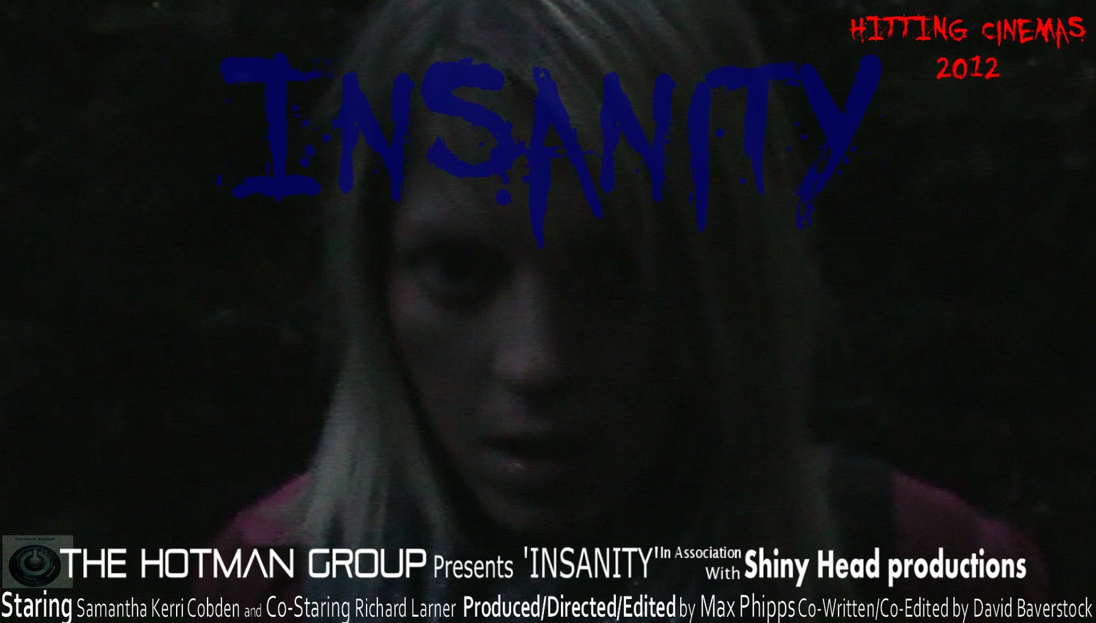
This is the final development was simply the production name as some people was questioning the role 'the hotman group' was playing so simply added media to the name to make it obvious of its role.
This was the last major development using a lighter back drop to show a little more detail in the image and being able to see the emotion on the face of the main character.


This is a development was created after I was given the tip of showing more action of what happens in the film. I was given mixed reactions with this poster so therefore created a survey to see what version was preferred by the viewers. 
In this survey I had the most recent poster as poster 1 and the previous one as poster 2 and as this graph clearly shows the original poster was the more preferred out of these two.

The next thing that I realised was the codes and conventions had been broken though the fact the release date was being very much overshadowed by the rest of the poster, not only this I also made the title become more apparent by using a lighter shade of blue to make it stand out against the dark background.
With the idea of working with corporations I added not only my own logo but also the logo of whom was helping me during the heavy development stage of this opening sequence.
The next things that I thought would give this poster a more professional look was logos as there were seen in most film posters such as: 20th Century Fox, Sony, Dolby Digital sound and other companies and media incorporations.
As developments went on I found through the research thast there is a lot of info on a poster such as who created/produced said film, who stars in said film, and any extra persons that were key to the creation of said film.

This is my first idea for the ancillary task of  a movie poster. The idea of using this image has been ideal since the filming was completed. This first idea consists of a very simple design that clearly needed to have improvements made to it. However this was a very strong base to add improvements to. The major parts to a movie poster are already here such as, Title of the film, when the film is being launched and a background that sets the theme and idea of the film.  

Poster Plan

After looking at many other movie posters, I gained an understanding on what is a 'must' in a movie poster. The most critical things are:
Eye catching lay out to captivate the audience
The poster includes an intriguing focal picture to have the audience asking questions
Clear Title to make it easy to read
Theme that shows the horror genre of the film
Will attract the target audience of 15+
Age certification may be displayed
Release date
Directors and Production Company displayed

Tuesday, 15 November 2011

Movie Poster

In preparation for the second ancillary we looked at movie posters to understand what was needed for the most effective advertisement.
This is an analysis of a horror Movie poster;


However the posters below are also what I used as inspiration for the set up and layout of my movie poster ;


Monday, 14 November 2011

Production Recap

Since the planning stage, we have completed filming and I have edited a rough cut of the footage into a sequence that fits the codes and conventions of horror movies such as The Blair Witch Project and Blue. The development has been extensive since discovering what we originally created was an opening sequence. The next stages that are needed to be taken is the finalising of footage editing, and the research and development of a Movie Poster  

Tuesday, 11 October 2011

New Story Boards


Insanity Script

Female Actress- Sam Cobden as Isabelle Jones
Male Actor- Richard Larner as Andrew Leight

Andrew: Isn’t it a nice evening to be out?
Isabelle: Yeah it’s really warm. Nice to be out.
Isabelle: This looks like a nice place?
Andrew: Yeah you're right! Let’s stop here……. right next to the trees!
(Putting food onto floor and sit down to start eating)
(A deafening scream has been heard deep within the forest)
Isabelle: What was that? Did you hear that? (Both characters are scanning the area for the source of the scream)
Andrew:  It sounded like it came from in there.
(Andrew points into the dense forest.)
Andrew: Why don’t we go and have a look! Come on let's go!
Isabelle: (hesitantly) I’m not sure I didn’t like the sound of that?
Andrew: Come on! Let’s go have a look, it could be interesting you never know!
(Andrew beckoning the friend to go further) See it's fine, what’s the worst that can happen?
 (Scream)
Isabelle: (worried voice) Oh my god, We should go NOW !!!
Andrew: No don’t worry, nothing is going to happen?
 (As Andrew walks past a bush, Andrew is dragged into  the bush out of sight)
Andrew: (screams) get off meeeee!! Help Isabelle please!!
(Isabelle turns around to look at the last moment to see the feet of their friend disappearing)
Isabelle: (concerned and scared) Andrew W-w-where have you gone?
Isabelle: (stern voice) Andrew! Andrew! Andrew!
Isabelle: (Runs around to the other side of the bush of where Andrew disappeared to see nothing)
Isabelle: (looking around sweaty and out of breath from running)
End Scene

Monday, 10 October 2011

Characters Back Stories

Andrew Leight 
 Andrew as a boy was obsessive about the great outdoors. Venturing out to discover the world, that hasn't changed to this day. When he was young it was camping in the garden until his parents finally cave into his want to go camping. He sensed he was the only one who really enjoyed it, so now Andrew goes to where he feels at most comfortable: outdoors, whenever he can. 

Isabelle Jones 
Isabel is your typical daddy's girl. You will find her whole room full of pink, pink and more pink, being her favourite colour. As Isabelle grew up she had a very fashion conscious upbringing since her mother owned a very successful clothes company but still was kept grounded by having to pull her weight around the house  and going to college just like anyone else.